
WillingHearts
School project
A streamlined volunteer platform redesigned to significantly increase engagement. By overhauling the information architecture and replacing high-friction sign-ups with a CMS-driven onboarding flow, this project delivers a clear, accessible, and frictionless experience for prospective volunteers.
Solo
Travis Tan
Scope
User Interviews
User Testing
Lo-fi Wireframing
Hi-fi Prototype
Time
2024
6 weeks

High friction onboarding
Volunteering with WillingHearts required sign-up, which presents a high friction point right in the beginning.

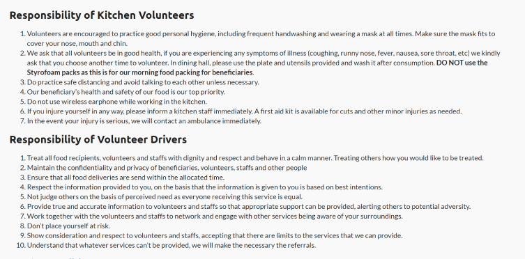
Disorganised information architecture
Key information was not divided effectively, resulting in an overwhelming 'information dump' that failed to consider the user's specific context and needs.
Difficult to scan
Information was not chunked and spaced effectively, resulting in difficult-to-scan, content-dense pages.


Poor UX copywriting
The site's original copy was more conversational than informational. Filler phrases (e.g. "This is a relatively simple task...") accumulate quickly, resulting in highly verbose pages that distracts from key information.
Clearer, faster sign-ups
Onboarding was streamlined by implementing a CMS-backed workflow. By utilising automated emails and unique user links to relay information, I eliminated the high-friction requirement of mandatory account creation.


Establishing information hierarchy and clarity
Role-specific responsibilities for Drivers or Kitchen volunteers are progressively disclosed as the user selects their preferred role.
Breadcrumbs was implemented to help user better grasp the site's architecture. Copy was optimised but remain friendly.
Fostering a shared experience (and urgency)
"Slots Left" feature was introduced, to foster a sense of shared experience and signal high demand, encouraging faster sign-ups.

Website audit
Externalising what felt "wrong" about a website into words was a highly effective exercise to question our own internal biases and build cases for our design decisions.


Lo-fi wireframing
In today's era of AI, lo-fi wireframing is largely discarded as an obselete technique. However to me it remains a critical step before writing a single prompt. It allowed me to eliminate visual noise, maintain clarity on the core problem statement, and build a strong structural foundation.
Talking to users
A staple of UI/UX projects. Affinity mapping was carried out in many successions, with frameworks like "Whys" and "So whats" driving further refinement to my design hypotheses.

More projects

